Tableau Bitesize: Buffer Calculations
- James Goodall

- Oct 2, 2020
- 3 min read
Updated: Nov 27, 2020
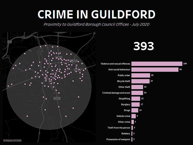
This blog post will detail the process of using buffer calculations, a new piece of functionality that was introduced in Tableau 2020.1, and hopefully help you to understand a little about how they work. The data sets we will be using will look at the number of crimes in relation to an office in Guildford in July 2020

I’ll go into the detail of how to create the full visualisation further down but I think it’s worth a minute going through the principle of buffer calculations via a quick how-to
Start off by connecting to the ‘office.csv’ file attached below
This file has ‘Latitude’ and ‘Longitude’ fields, so we can create our buffer calculation from these
Before we do that, however, we need to create a spatial point field, and we can do this via the MAKEPOINT functionality
Create a calculated point called ‘Office Location’ as follows (this will create a spatial point for us):

Next, create another calculated field, which will be our buffer, called ‘Office Buffer’ as follows:

The arguments passed into the 'BUFFER' function are a spatial point location, followed by a radius, followed by the unit that radius is measures in. We're hard-coding this at the moment, but this can become dynamic, as described in a couple of steps
Double click on the ‘Office Buffer’ field and you can see that this adds in the 'Latitude' and 'Longitude' fields, then creates a 2km buffered zone around the point location of the office

Create a parameter called ‘Radius’ with a type of integer and value of 2

Next create a parameter called ‘Unit’ with a type of String, and list values of ‘miles’ and ‘km’

You can then replace the ‘2’ and the ‘km’ in the ‘Office Buffer’ calculated field with these two parameters making the end user the controller of this

OK so that’s the basic principle of buffer calculations, now let’s get on to how we build this dashboard
We will need to combine another dataset with the original ‘office.csv’ file and we will need to do this via a spatial join
Navigate to the Data Source tab, & add in the additional data source ‘crimes_guildford_july_2020.csv’ attached below
Then, double click into the ‘office.csv’ table to bring up the ‘old-style’ join window, drag the ‘crimes_guildford_july_2020.csv’ table and enter the following join calculation against the ‘office.csv’ table (the left side):

Enter this join calculation for the ‘crimes_guildford_july_2020’ data source (the right side):

Change the join type to ‘Intersects’

OK now we can start building out our charts again, but we need to create a few fields
Create a new calculated field called ‘Distance’ as follows:

Create another called ‘Crimes’:

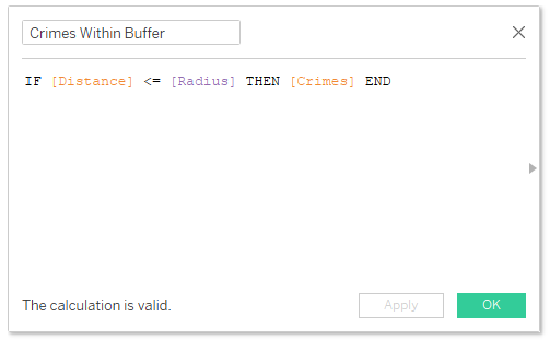
Create one called ‘Crimes Within Buffer’:

And finally, we will want to count how many crimes are within the buffer radius & we’ll need a calculated field to do this, so create one called ‘Count of Crimes Within Buffer’:

OK, using the sheet we created earlier, hold control and copy the ‘Latitude’ pill on the ‘Rows’ shelf to create a dual axis map

On the second card, remove the ‘Office Buffer’ field and replace it with the ‘Crimes Within Buffer’ field

Right click on the second ‘Latitude’ pill and select ‘Dual Axis’, then colour the two cards different colours

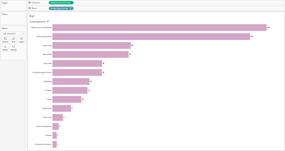
Next create a new sheet called ‘Bar’ and drag the ‘Crime type’ dimension onto the ‘Rows’ shelf, the ‘Count of Crimes Within Buffer’ field to the ’Columns’ shelf and format to your choosing

Finally, the last sheet to create for the BAN is one called ‘Total’ – drag the ‘Total Crimes Within Buffer’ field onto the ‘Text’ mark and format to your choosing

OK now we can start creating our dashboard
I added a title, popped the map on the left hand side, then the ‘Total’ and ‘Bar’ sheets on the right hand side

Next, we want to add in the parameter controls, so click on ‘Analysis -> Parameter’ then show the ‘Radius’ and the ‘Unit’ parameters, arrange on the dashboard and there you have it - an interactive dashboard allowing a user to set a buffer radius and return the number of instances within that geographic area
Tableau Public Interactive Version:


Comentários